

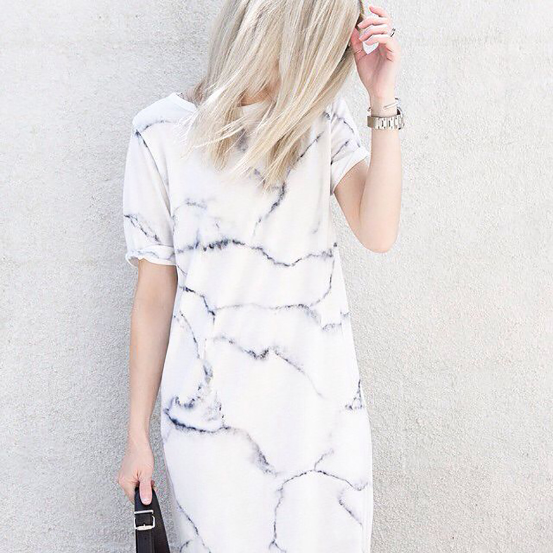
…if you hadn’t already figured that one out (especially if you follow my Pinterest account and saw my home feature with Sheerluxe). I don´t know what it is about it that gets me – the inconsistency, the soft, yet graphic and harder look… I especially love it within interiors; kitchen worktops, bathrooms, smaller artefacts, tiles – and more recently with the print trancenseding onto clothing, laptop covers, wallpaper… From classic grey hues, to eye catching neon and gold foiled – I love it all.
The trick, especially within interior, is not overkilling it – to get the full effect. I am already planning several styles and variations for our new home – I can´t wait to get started!


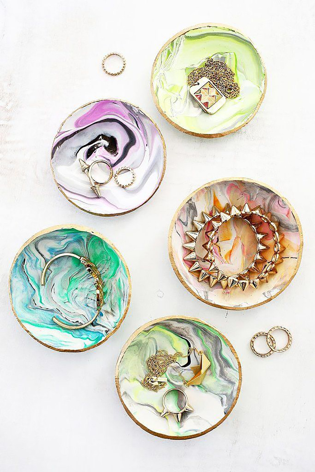
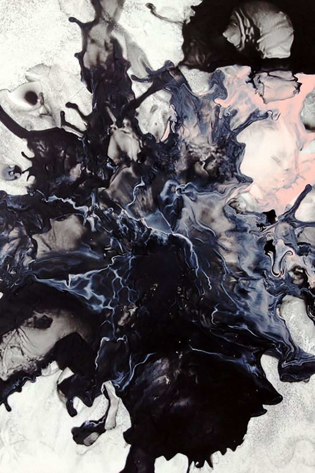

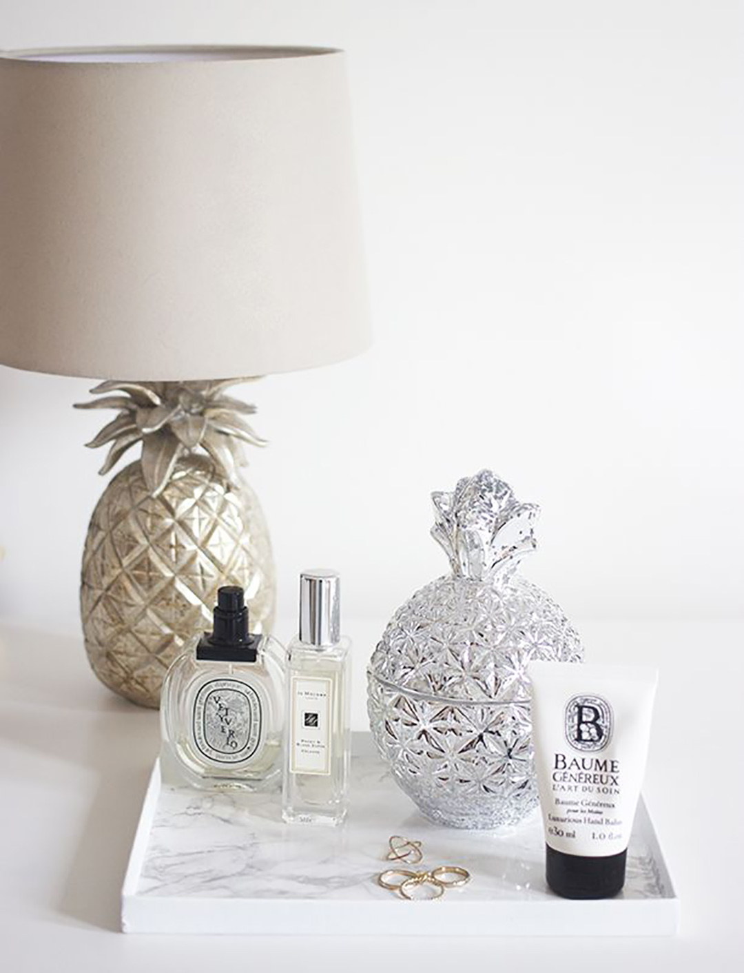


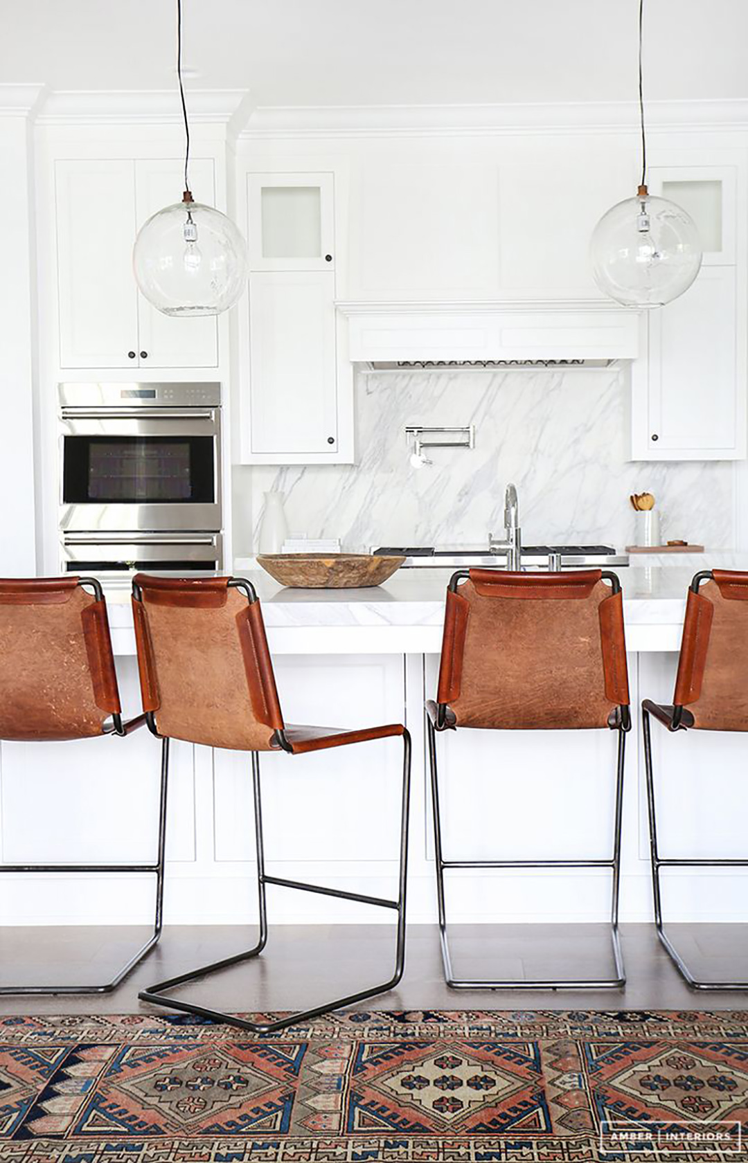

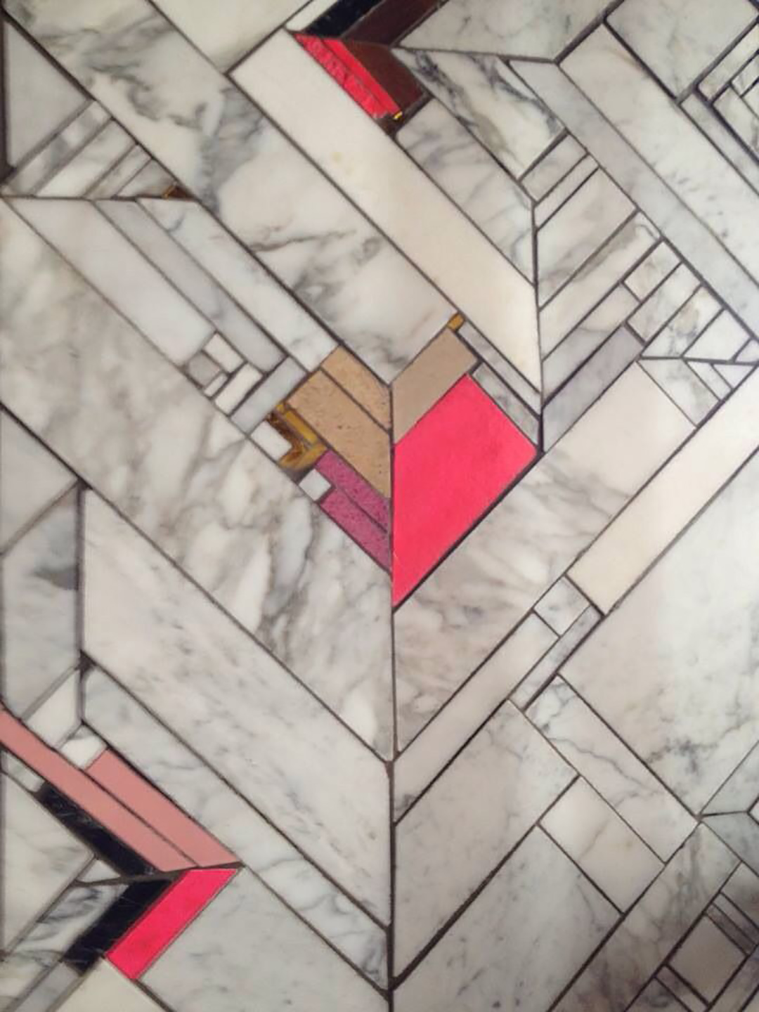


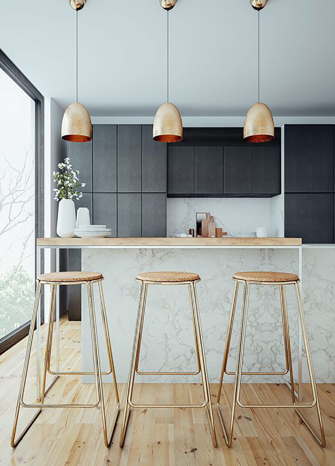


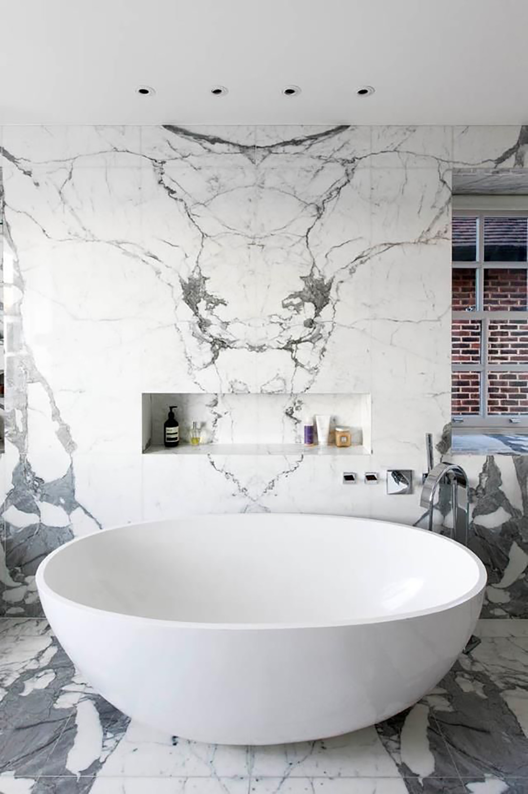


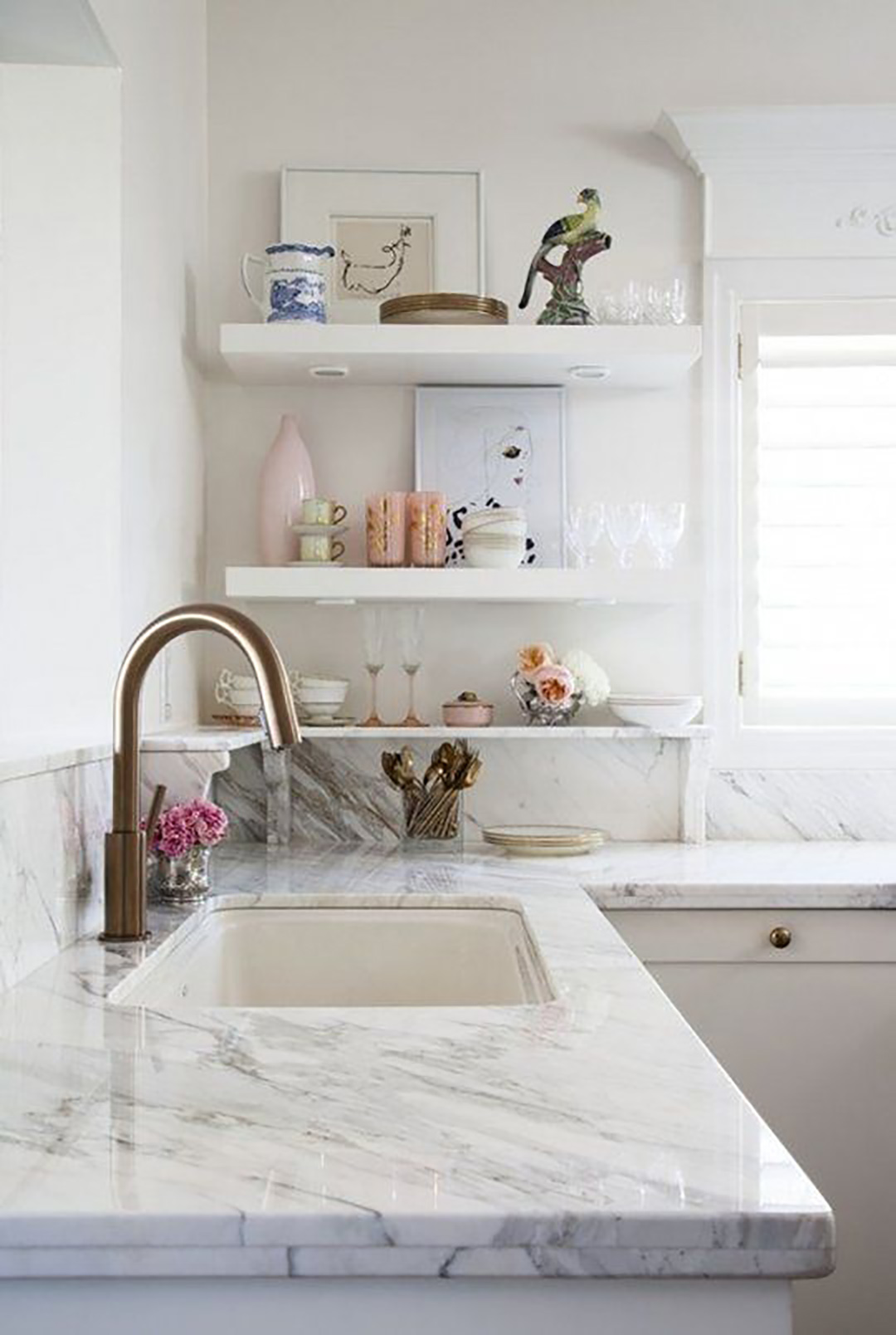
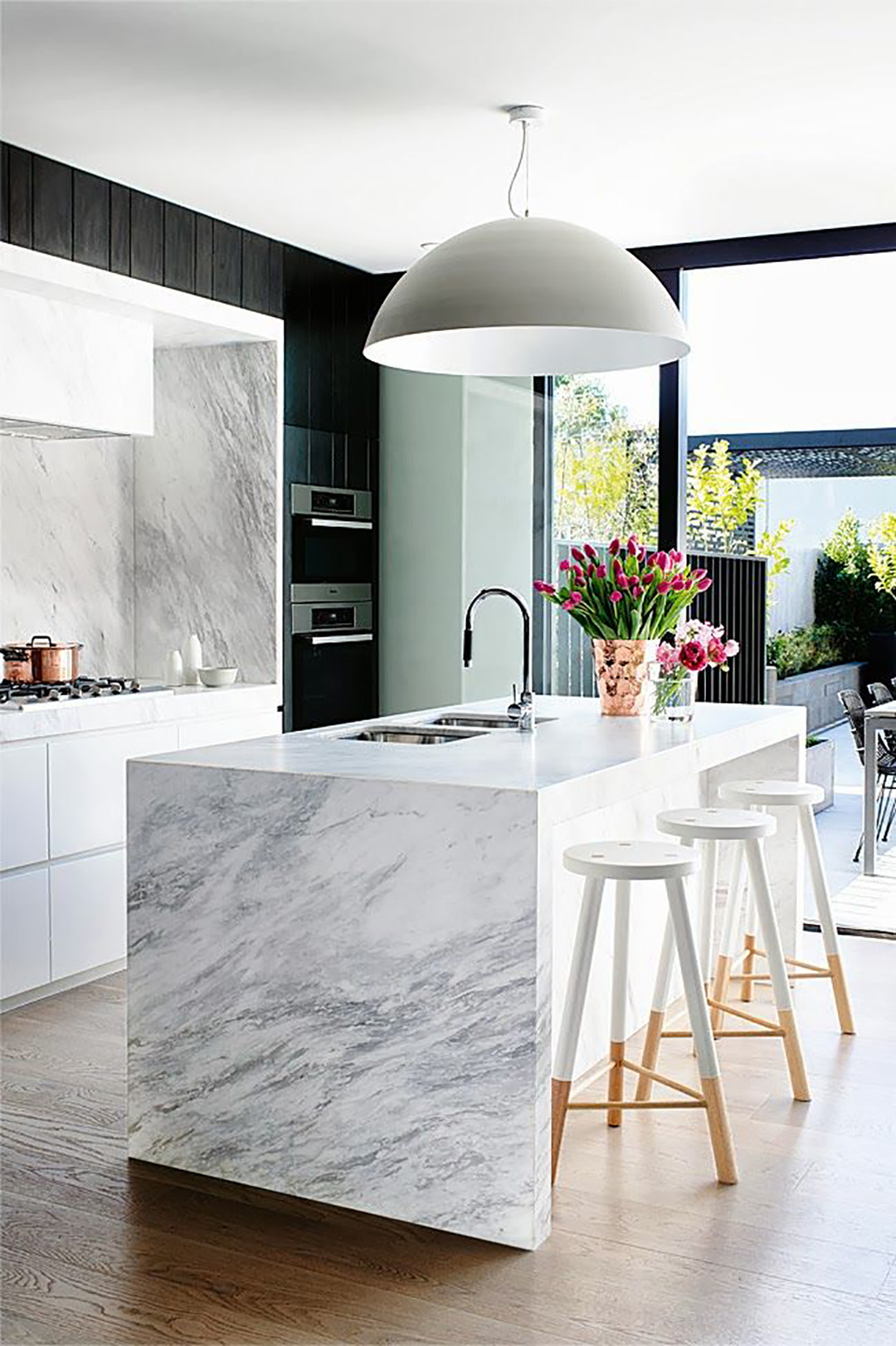

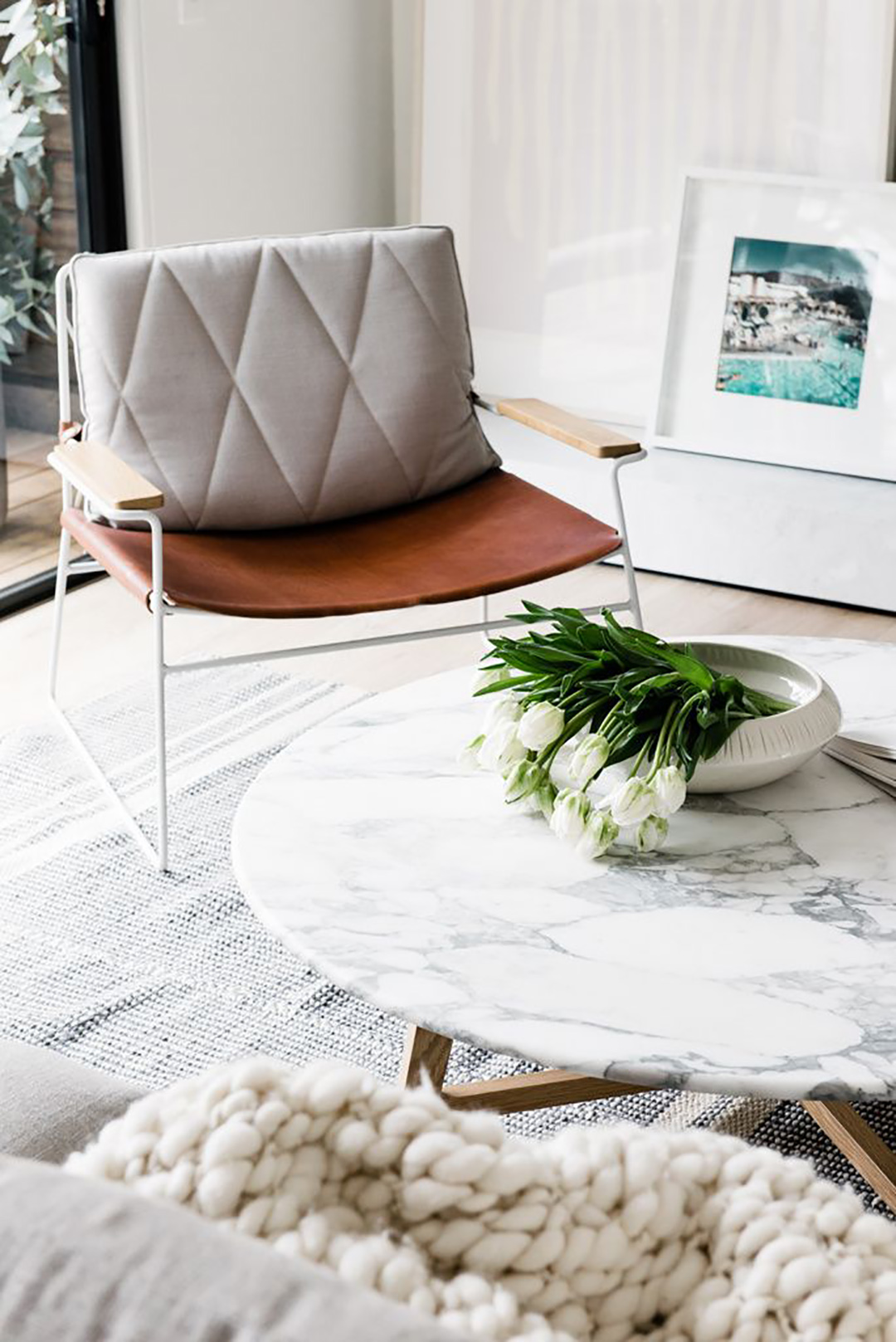

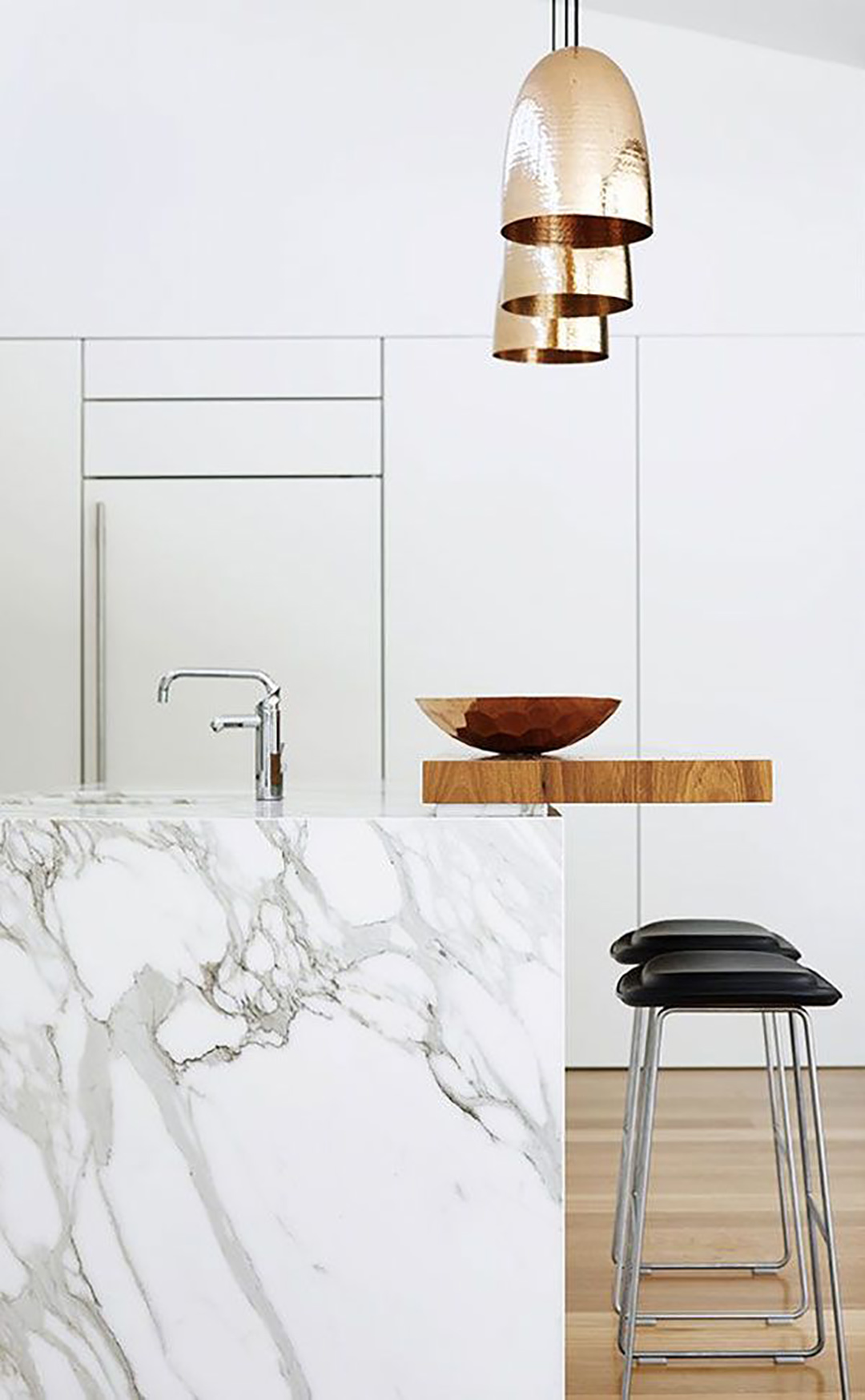
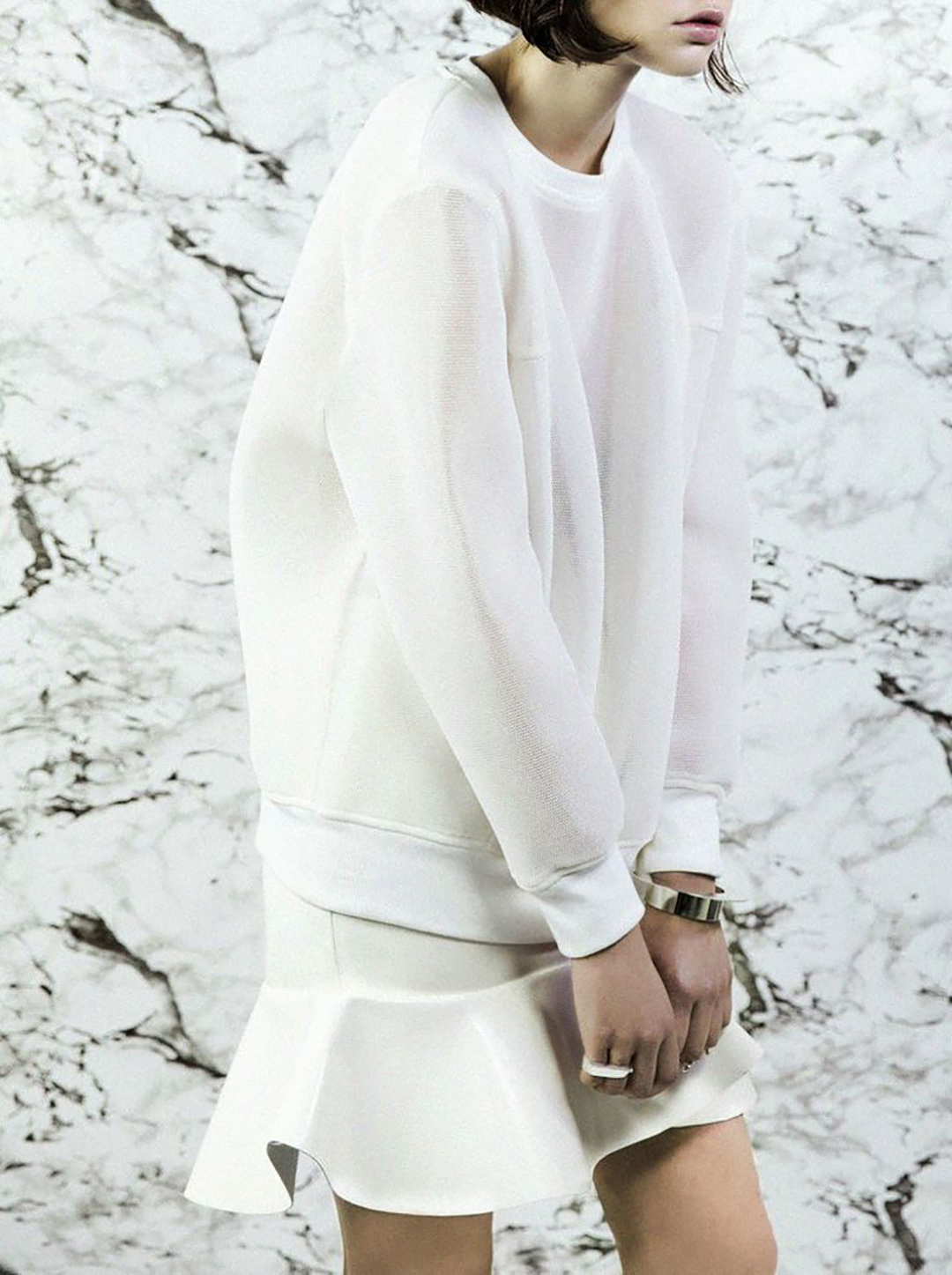
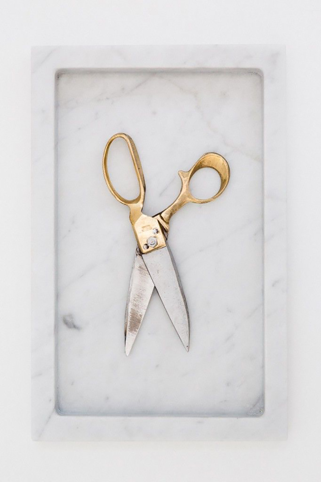

*Picture courtesy: My Pinterest

I found so many interesting stuff in your blog especially its discussion. From the tons of comments on your articles, I guess I am not the only one having all the enjoyment here! keep up the good work.
Wow, cool post. I’d like to write like this too – taking time and real hard work to make a great article… but I put things off too much and never seem to get started. Thanks though.
Amazing blog & phenomenal writting. It was truly informative, thank you for putting all the effort that you did in writting this exceptional blog!
Great article really impressed . I think you should also write article about Senta Jewelry. This will be beneficial for others I guess thank you.